A flyer, a phone number, and a business that deserved a front door.
A new shared-housing business in Valdosta needed a website that said what the flyer said, only better. A brand rebuilt from that flyer, two full design directions with every section chosen by the client from live variants, one inquiry form that lands in her inbox, and a phone number that is never more than a tap away.
The brief
Lorraine Hunt came with a flyer and a phone number. Your Home 2 offers furnished rooms with every utility included, run as a household rather than a facility, built with seniors, veterans and disabled veterans in mind. The flyer said all of that in one panel. She needed a website that said it to the people the flyer never reaches.
The site had to welcome everyone in plain language while still speaking to the people she built it for: fair-housing law does not care about intentions, only about what the page says. And many of these visitors will never type into a form, so the phone had to be one tap away, everywhere.
The work
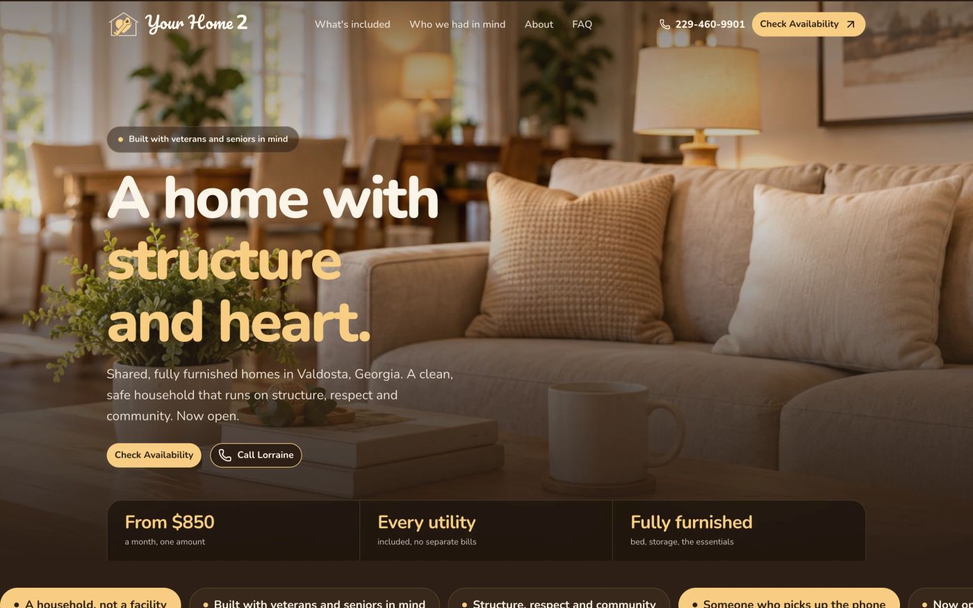
The brand came first, rebuilt from the flyer: a vector logo, a cream-and-honey palette, two typefaces. Then two full landing-page directions, a warm light one and a reference-led dark one, as private pages Lorraine could open on her phone.
Neither went straight to code. Each section was rebuilt from a round of live variants, and the client picked. Every choice and its link is recorded in the repo, so nothing on the page is there by accident.
An outside review read the audience section as "for these groups only". The same day it became "who we had in mind" with an all-backgrounds welcome, the price line was narrowed to what it covers, a privacy page went up, and two flag-and-veteran stock photos became a kitchen table and a living room.
What got built:
- A Nuxt front end carrying both directions in one app, sharing every fact, the form and the privacy page.
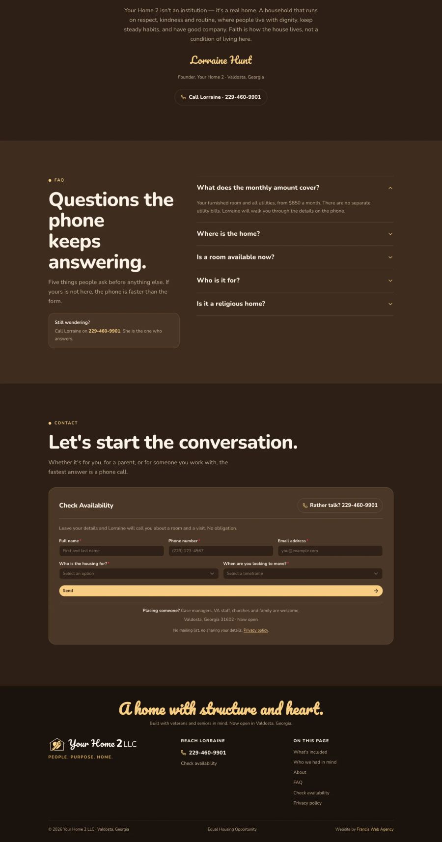
- One inquiry form, posting through a server route to Sanity, where Lorraine reads inquiries in a hosted Studio. The form asks who the housing is for and when, never about veteran or disability status.
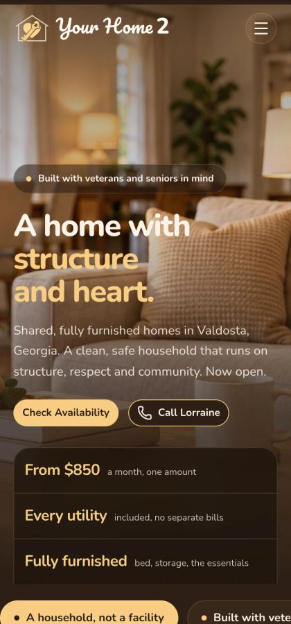
- Every phone number a call link, with a floating header that keeps it in reach as the page scrolls.
- A local-search page title and LocalBusiness structured data.
- A private preview, marked noindex, that the client reviews from her phone.
How it runs
Nuxt 4 and Nuxt UI on Tailwind CSS v4, content and inquiries in Sanity, Node behind nginx with Let's Encrypt on a small DigitalOcean server. Review captures come from Playwright.

“Kasan exceeded my expectations. The website looks amazing, and I couldn't believe how quickly he brought everything together. He took my vision and turned it into something even better than I imagined.”
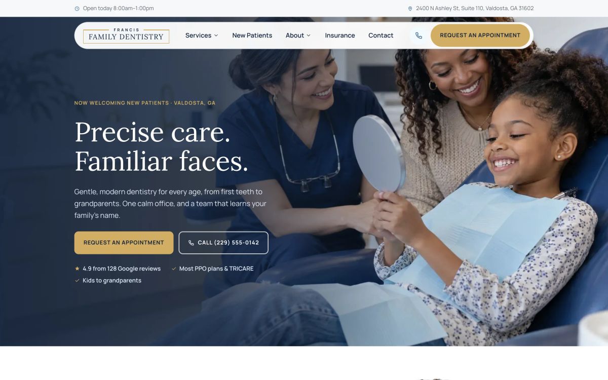
A dental website a family would trust before they ever call.
Read Case Study→