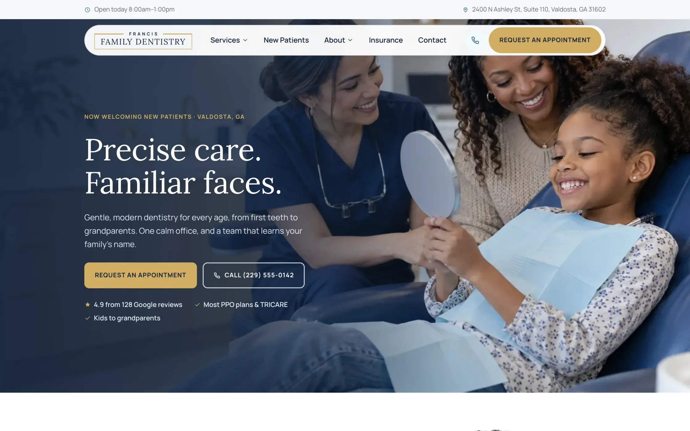
The brief
Most dental websites look the same: a stock smile, a list of services, and a phone number. They tell you a practice exists. They rarely answer what a new patient actually wants to know: what happens at the first visit, what it costs, whether anyone will judge them for staying away for years, and how to book without a phone call.
Francis Family Dentistry is a concept, not a client. It's a fictional family practice in Valdosta, opened in 2026, with a small team and a simple promise: unhurried visits and the same familiar faces every time. I built the whole website the way I would for a real practice, so a dentist can see what their site could be before we ever talk.
A design system made for the brand
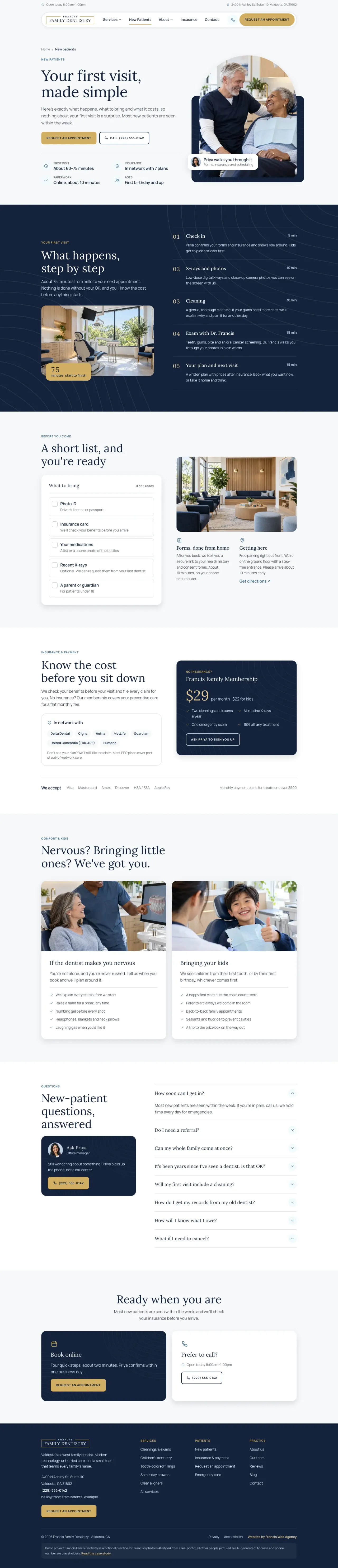
The look is called Harbor Navy: a deep navy, a soft brass, a harbor blue and a warm porcelain white. Headings are set in Lora, a serif with some warmth to it, and everything else in Manrope. Every color, size and space comes from one set of tokens, so all twenty-four pages feel like the same practice.
The details repeat on purpose: an arch-shaped photo frame, a faint contour pattern on the navy sections, and brass reserved for the things you can press.
Built section by section
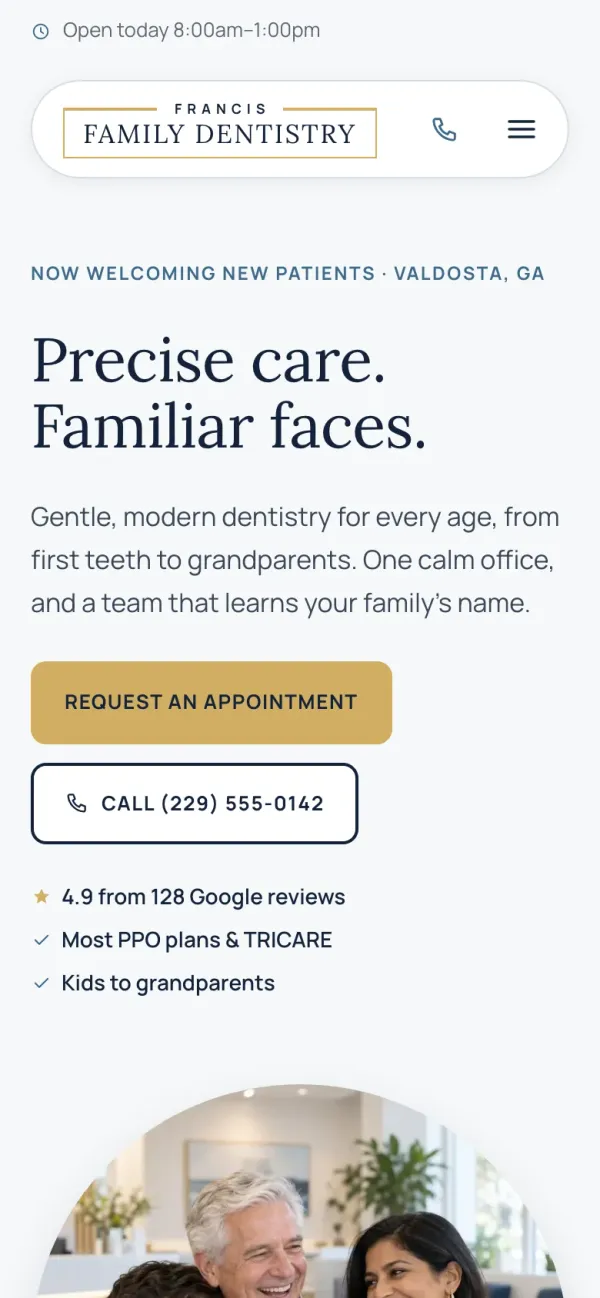
Every page was built from the top down, one section at a time. For each section I designed two or three versions, compared them side by side on desktop and phone, and picked one before moving on. The home page alone went through ten rounds of that.
It's slower than designing a whole page at once, but every section earns its place, and nothing ends up on the page just because a template had a slot for it.
Photography without a photo shoot
A practice that doesn't exist can't book a photographer, so every image on the site is generated: the families in the chair, the waiting room, the treatment room and the team. Each one was written as a detailed prompt with a shared style block, so the light, color and lens feel like a single shoot. The cast is deliberately diverse, because a family practice in South Georgia serves everyone.
Dr. Francis is the one exception: the dentist is played by me, and the portrait is styled from my own photo.
What the site does
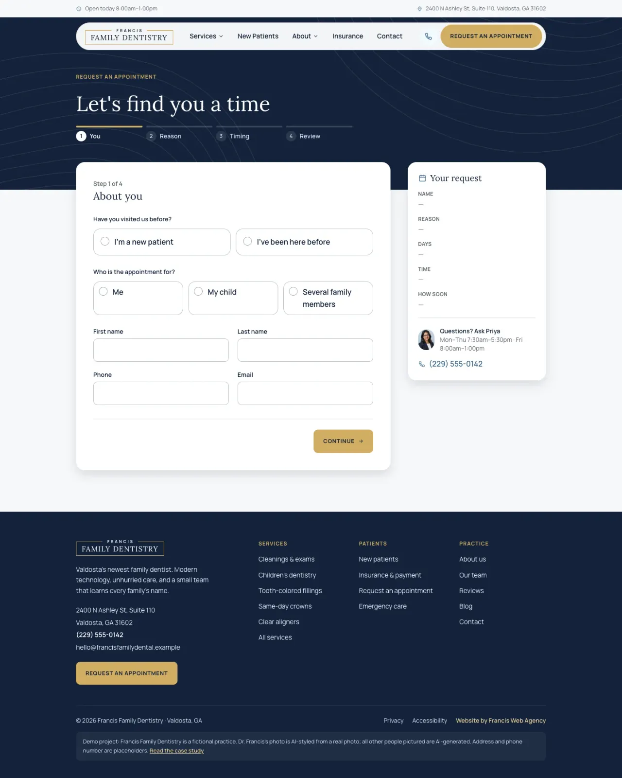
- Booking in four steps. About you, the reason for the visit, the days and times that work, then a review. Each step is checked on the server, errors explain themselves in plain words, and a live summary fills in as you go.
- A new-patient guide. The first visit minute by minute, a what-to-bring checklist you can tick off, insurance and membership, comfort options for nervous patients and kids, and the questions people ask.
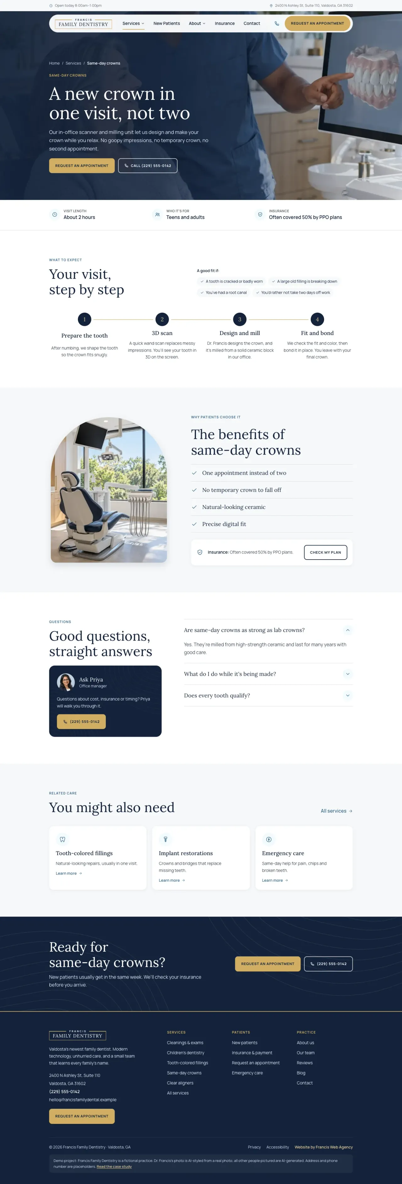
- Every service explained. Eight service pages, each with what to expect, who it's for, what it costs with insurance, and its own questions, linked straight to booking with the service already chosen.
- Proof from patients. Reviews you can filter by what matters to you: kids, nerves, same-day crowns, emergencies or insurance.
- A blog the team writes. Short, practical guides with the author's face on every post.
- Motion with manners. The home page has a staggered entrance, a gently drifting photo and a menu that opens as a circle from its button. All of it turns off for anyone who asks their device for reduced motion.
Built with
- Next.js with the App Router. Almost every page is rendered ahead of time and arrives as finished HTML.
- Tailwind CSS, driven by the brand's design tokens.
- Server actions with Zod behind the booking and contact forms. Booking runs the same rules in the browser and again on the server.
- CSS-only animation, including scroll-driven effects. No animation library.
- Hosted on my own server in a Docker container, kept out of search engines because the practice isn't real.
From planning and design to writing and development, it took a little over two days.
What it shows
A dental website doesn't need to be a brochure. It can do the front desk's first job: explain the visit, answer the cost question, settle the nerves, and take the request. That's what a real practice gets when we build theirs, with their team, their photos and their voice.