The website had to prove the point.
Francis Web Agency needed a website that did more than list services. It had to show, within a few seconds, the difference between a website that simply exists and one that has been designed, written, and built around a business.
What needed to change
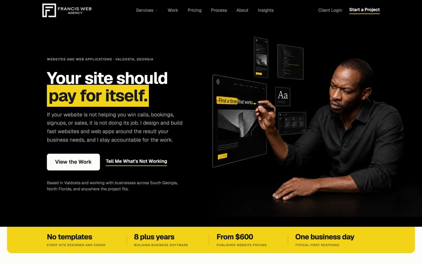
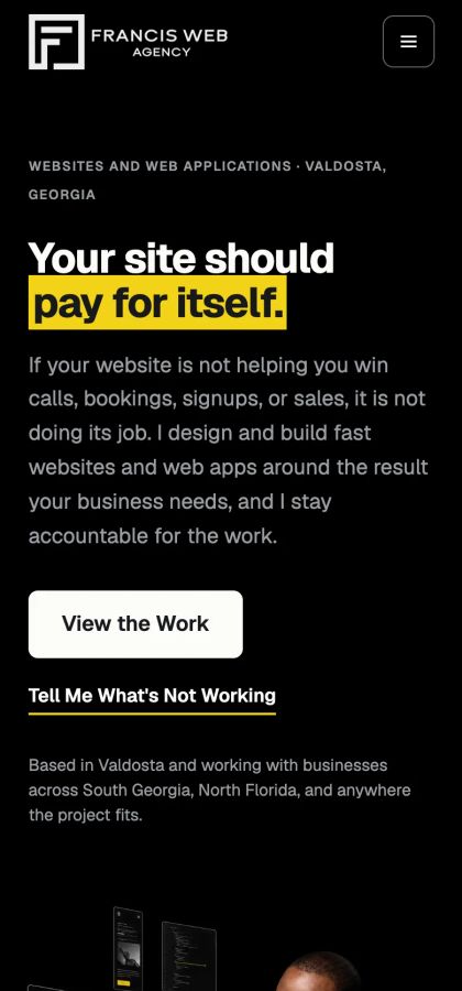
I build custom websites and web applications for businesses, so my own website carries more weight than most. A potential client shouldn't have to take my word for it when I say I can design, develop, integrate, optimize, and manage a serious website. They should be able to see it for themselves.
The old FWA site worked, but it didn't show that. The branding was weak, the presentation felt generic, and it didn't reflect what I could actually build. And as AI website builders made it easy to generate a passable site in a few minutes, looking merely “professional” was no longer enough.
The goal became simple: build a site that makes a business owner think, “This man knows what he's doing.”
The strategy
Start with the message, not the layout.
The copy and structure were settled before development began: what every page needed to say, which questions it had to answer, and what it should lead to. Animations, components and polish came after. That kept the design serving the message instead of forcing the message into a design, and it gave the whole site one voice: direct, confident, clear, and without the usual agency filler. It came with one rule, too: the site only makes claims a visitor can check.
Build a brand people can recognize.
The visual system is called Highlighter: black ink, warm paper, and one unmistakable yellow. A highlighter calls attention to what matters, and that principle runs through the site. Important words, actions and proof get the emphasis, and nothing else competes with them. The result feels like Francis Web Agency, not like any other web company.
Show the difference instead of explaining it.
There's no purchased theme and no drag-and-drop builder underneath. The layout, responsive behavior, interactions, components and integrations were built for FWA.
AI builders are getting very good at producing websites quickly, and for a business that only needs something basic, that may be enough. FWA is for businesses that need more than that, so the site had to demonstrate it through the work itself: stronger branding, deliberate UX decisions, custom functionality, deeper integrations, and software when a project goes beyond a marketing site.
Part of the business, not a brochure
One lead flow
When someone sends an inquiry, it goes to my email and straight into the operations software I built to run the agency. The AI receptionist feeds the same place: a caller explains what they need, and it lands in the same workflow as the form. The website, the phone and the agency's operations are one system instead of separate tools.
The site even sells the receptionist it uses. A prospect can call the demo line and hear it before buying it.
Pricing without the mystery
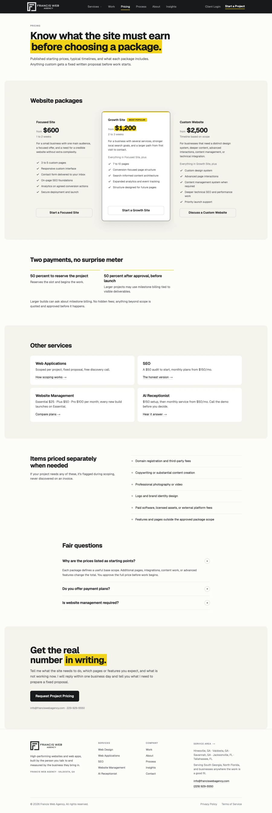
Starting prices are published on the site. Transparency matters to me, and it qualifies potential clients before we ever speak: someone considering FWA can see the investment, what's included, and whether it fits their budget. The first conversation can then be about the business and the project instead of dancing around the price.
Local SEO with a real service area behind it
Valdosta, Hinesville, Savannah, Jacksonville and Tallahassee each have their own page, written for that market rather than a city name swapped into the same template. They aren't there to make the map look bigger. They're the region I can realistically serve, with the focus on Valdosta, Hinesville, South Georgia and North Florida, and the markets where I want FWA to build lasting client relationships.
Built from scratch in just under two weeks.
Strategy, copy, design, development, integrations, responsive testing and deployment came together in just under two weeks.
- A custom, server-rendered Nuxt front end. Every page arrives as finished HTML, with or without JavaScript.
- Motion built by hand and used deliberately: it fires once, and it honors reduced-motion settings. No animation library.
- Content that changes regularly (articles, case studies and testimonials) is managed in Sanity. Everything else lives in code, where it can't drift.
- Hosted and maintained on infrastructure I run myself.
The technical decisions matter, but they aren't the point. The point is having enough control over the technology to build the experience the business actually needs.
The outcome
This case study is going up before there's enough data to say anything meaningful about traffic, rankings or leads. That's deliberate. There will be no invented percentage increase, no performance statistic dressed up as business growth, and no victory lap a few weeks after launch.
The immediate result is more fundamental: Francis Web Agency finally has a website that represents the level of work I want clients to hire me for. It has a brand people can recognize. It shows what I can design and build, and that FWA can handle more than a brochure site. It connects lead generation to the systems behind the business. And it gives the agency a foundation for organic visibility across South Georgia and North Florida.
The next results will come from what the site was built to do: attract the right businesses, bring in qualified inquiries, and turn more of those conversations into projects. Those numbers will be added when there are enough of them to mean something.
The client's words
“Demanding client. Kept changing the hero. Would hire again.”
Kasan Francis, the client. Also the agency.

A flyer, a phone number, and a business that deserved a front door.
Read Case Study→